My Work
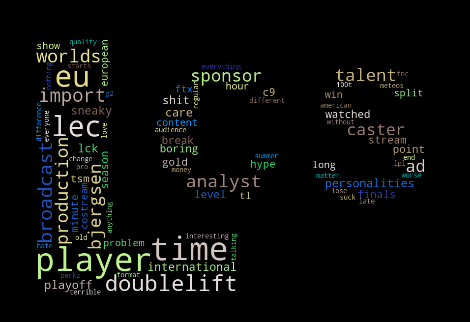
LCS Viewership Decline Word Cloud
An article was recently released saying that the 2021 LCS Summer Split had the lowest peak viewership count of any LCS season over the last five years. There are many reasons for this decline in viewership, and users in the r/leagueoflegends subreddit posted their thoughts on why this may happening, or why they no longer watch the games, in a reddit post that amassed over 1,000 comments.
As an avid viewer of the LCS myself, I was curious to know what people thought were the reasons for the decline. Using the reddit API, I decided to pull all the comments in the reddit thread, and create a word cloud that would summarize the most frequently used words. Most of the time was spent on processing the text in a way that would show accurate insights. This includes identifying as many stop words as possible, and aggregating similar references together (ex. both "dl" and "dlift" refer to the player "Doublelift").
- praw
- wordcloud

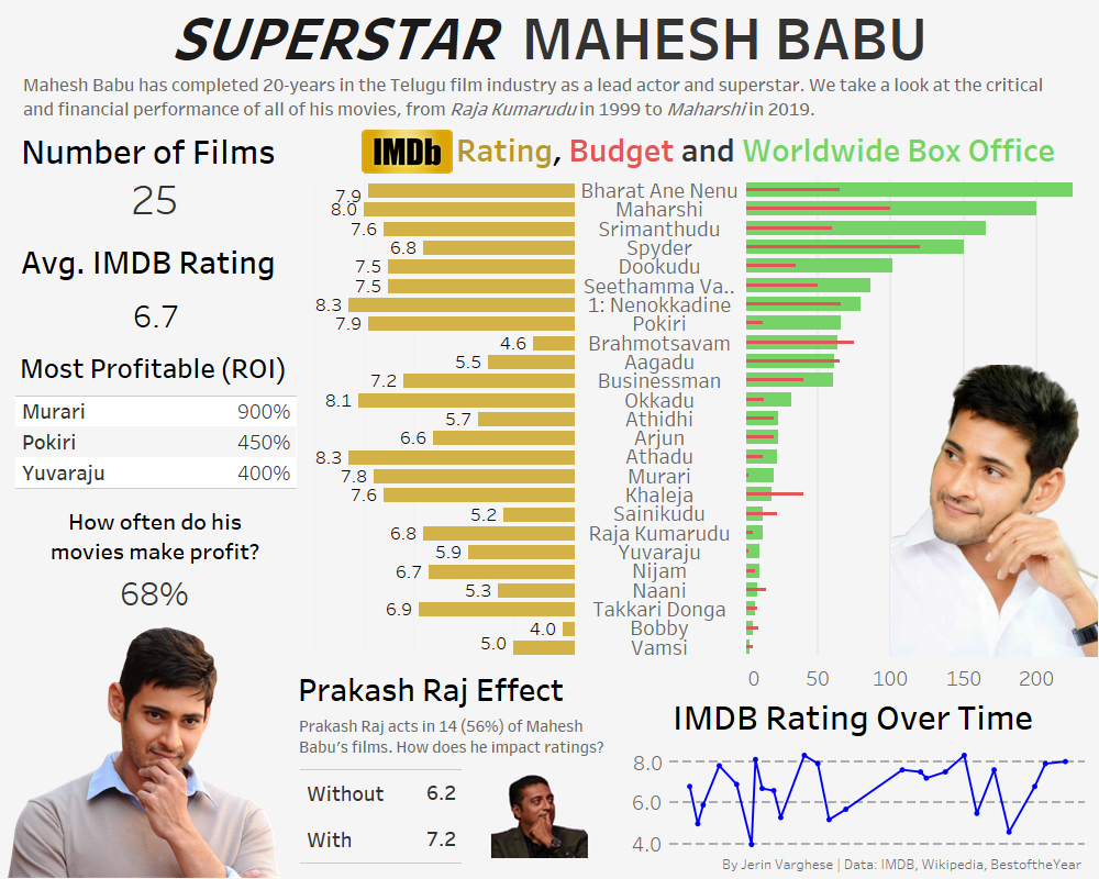
Mahesh Babu's 20 Year Career
I started watching a lot of Telugu movies in college. When it comes to domination in Tollywood's box office, there is no doubt that Mahesh Babu is at the top of the list. It didn't take long for me to become a Mahesh Babu fan after watching movies like Athadu, Dookudu, and Pokiri. While his acting ability is heavily memed, he never fails to entertain me.
To celebrate 20 years of him in the industry, I decided to collect some data on budget, box office, and IMDB ratings for all his movies. I was learning Tableau at the time, and so I used this opportunity to design a dashboard summarizing his career. You'll see that his movies are a hit or miss. When they're bad, they're really bad. When they're good, they're really good.
- Tableau
- Microsoft Excel

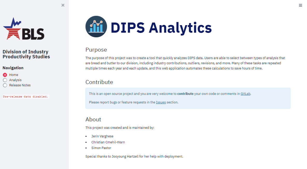
Industry Productivity Analysis Web App
The Division of Industry Productivity Studies publishes labor productivity and costs data by industry on an annual basis. Every year, there are multiple releases - each one updating a different group of industries (i.e. manufacturing, trade, etc.). Economists analyze the updated data and search for the main story in that industry group. Many approaches to analyzing the new data are repeated each year, across each release.
My idea was that - if there are tasks being repeated, then there is an opportunity for automation. Using Python, I led a small team in developing a web application that pulled live data from the division's SQL Server database, and allowed users to select different types of analysis to quickly obtain statistical calculations and visualizations. This product was well received by both managers and analysts alike, as it automated the bread and butter analysis done in the office, and saved days of work done each year before each release.
- streamlit
- altair
- sqlalchemy
- pandas
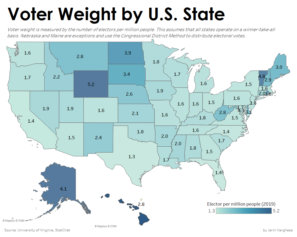
Voter Weight by U.S. State
The topic of the Electoral College and whether it should exist comes up as a hot debate every four years during the U.S. presidential election. It is well known that the Electoral College provides an advantage to voters in small states. But how big is this advantage?
Using Microsoft Excel and Tableau, I created a visualization that quantified the amount of weight each voter has in each state. It is shocking to see the difference in weights between small states and large states. A vote in Wyoming has nearly five times the amount of weight than a vote in California!
- Tableau
- Microsoft Excel
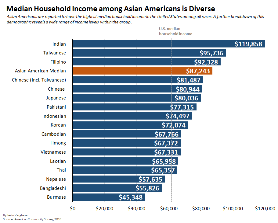
Median Household Income Among Asian Americans
The U.S. Census Bureau reports Asians as the race with the highest median household income, as can be seen here. However, looking at this demographic at a more disaggregate level reveals a diverse socioeconomic experience within the group itself.
For background - at work, I was frequently using the American Community Survey (ACS) for a project about labor composition. The ACS is one of the largest household surveys in the U.S., with nearly 3.5 million households surveyed per year. With the abundance of information it gathers, I wanted to use it to answer a different question - what does household income look like among Asian Americans? I used Python to import, parse, and calculate the data I needed, and then used Microsoft Excel to create a visualization.
- pandas
- Microsoft Excel
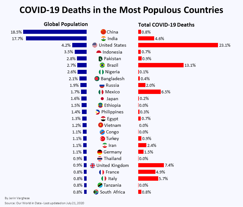
COVID-19 Deaths
During the COVID-19 pandemic, many statistics that were used to compare the impact of the virus on countries across the world. More specifically, the absolute number of COVID-19 deaths were repeated to us on a daily basis, without taking into account the country's population. Using Python, I created a data visualization showing the share of total COVID-19 deaths in some of the largest countries in the world, along with their share of the global population.
- pandas
- matplotlib
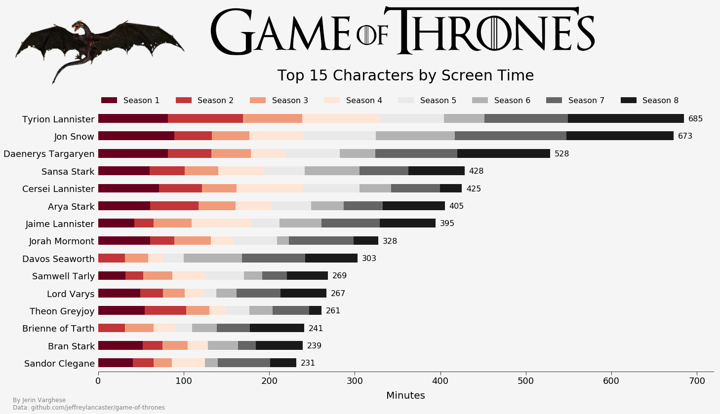
Game of Thrones Screen Time
Following the (extremely disappointing) Game of Thrones finale, I was curious to know which characters had the most screen time on the show. Using a large database put together by a very passionate Game of Thrones viewer, I used Python to extract data and create a visualization that showed the top characters by screen time, broken down by season.
- pandas
- matplotlib
Technical Skills


About Me
I am currently a Data Scientist working for the Division of Industry Productivity Studies at the U.S. Bureau of Labor Statistics. I am experienced in both Python and SAS programming languages, building ETL pipelines, statistical analysis, data visualization, and presenting information to different types of audiences. I love getting into the itty-gritty of data extraction and cleaning, and finding creative ways to automate repetitive tasks.
My Resume